
We live in an age of data and numbers, but numbers alone don’t say much anymore—stories do. You may spend hours preparing, inspecting, and manipulating data for analysis, but if you cannot deliver your findings with clarity and confidence, all your efforts may end up in the trash. Be it explaining a sales rise to your boss or displaying performance statistics to a client, or demonstrating your end project in a data analytics course, the skill of communicating your findings is what matters the most.
This blog will serve as a guide to building the right presentation skills for analysing data, so you can transform complicated data into valuable narratives that anyone can read and understand the real insight it hold.

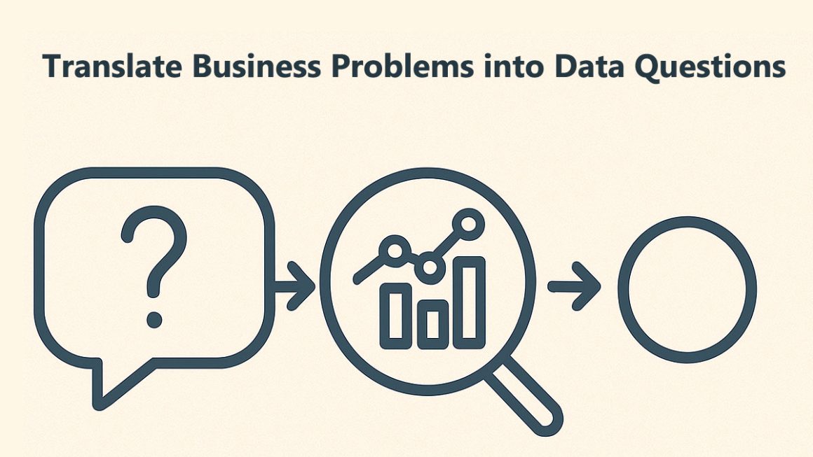
What Makes Presentation Skills Important In Data Analytics?
Data analysis is not about playing with spreadsheets, SQL queries, or Python scripts: it is about making data comprehensible. Picture this — you analyze thousands of rows of data, you unveil golden insights, and when you share your findings, no one gives a damn. Why? Because your audience is not looking for data, they are looking for clarity, context, and connection.
Good presentation skills help you:
- Explain and make a valid pitch of complex data to a non-technical audience,
- Create clarity and confidence for trust to build.
- Help executives make better, cost-effective choices.
- Demonstrate professionalism and analytical thinking.
So to put it simply, presentation skills enable your data to do the talking for you—loudly and clearly.
Step 1: Know Your Audience
But before getting your slides and charts ready, who will you be talking to? Are they techies and business leaders, or clients without any data background?
If your audience is top management, they do not care about code or formulae, but about output, knowledge, and impact. Conversely, if your audience is your technical team, they could benefit from more analytical granularity.
Tip: Remove or Change Language, Visuals, and Examples depending on your audience’s understanding. Make it straightforward, on-topic, and purposeful.
Step 2: Structure Your Story
The voice of data storytelling: A good data presentation is a story with a beginning, middle, and end.
You are not flashing charts on the screen; you are leading your audience on a journey.
Here is a simple way to structure it:
- Introduction: What problem are you solving — in other words, why should people care? Why is it important?
- Analyze: What type of data have you collected, and what approach did you use to analyze it?
- Results: What patterns or trends did you find?
- Insights: What does this data tell the business or project?
- Recommendations: Actions to take (based on your analysis)
Example:
For sales data, begin with the goal: “Our goal was to figure out why our sales went down in Q3. Next, you want to address your data source, how you will analyze it, key findings, and finally solutions that you recommend—“Our sales could be up by 15% next quarter if we improve marketing efforts by region”.
Step 3: Use Visuals That Tell a Story
Charts, graphs, and dashboards are all effective tools, but only if they are used properly. One of the most common mistakes made by analysts is trying to fit too much data into a single slide.
A few tips for showing things visually:
- Use bar charts for comparisons.
- Use line Charts to show trends based on time
- Pie charts are an effective tool only when the proportions are readily apparent.
- Use colour or labels to identify key numbers or outliers.
- Steer clear of clutter—keep visuals simple and clean.
Visuals should complement your message, not confuse your audience, so keep that in mind. An effective visual enables them to visualise the data story immediately.
Step 4: Focus on Insights, Not Just Data
Providing numbers is something anyone can do — but how many can give meaning to them?
Instead of saying, “We saw our sales went down by 10% Say: “Our sales were down 10% in the North due to fewer festival campaigns, but strong promotions in the southern region ensured a healthy volume of sales.”
This method turns you from a data presenter into a data storyteller.
Always connect data to action. Explain to your audience the implications of that insight and the next action that could be taken on it. That’s how real decision-making happens.
Step 5: Practice Your Delivery
Slides can only take you so far visually. Rehearse your tone, body language, and timing well before your actual presentation.
Here are some quick tips:
- Speak clearly and slowly. Avoid reading directly from slides.
- Keep making eye contact with the people you are presenting to.
- Use natural hand gestures — such as pointing — to highlight key points.
- Practice your timing so that you stay within limits.
- Consider what you might be asked and how to respond.
Confidence is a practice, not perfection. The more you present, the better you will become.
Step 6: Keep It Interactive
Instead of shouting at your audience, interact with them. Ask questions like:
- Ask, “What does this trend suggest to you?”
- Ask, “Is there a similar trend in your department?”
Short engagements are an effective way to maintain your audience’s attention and help them relate to your insights. It also keeps your presentation sounding more human and real.
Step 7: Use the Right Tools
Tools play a major role in how you present your analysis. You do not need a bunch of different fancy software — just the right ones.
Here are some of the best tools for presenting professional presentations.
- Microsoft Power BI – Best for Interactive Dashboards
- Tableau — for storytelling using visuals.
- Excel — basic but effective for fast analysis along with visualisation.
- Google Slides or PowerPoint – Perfect for showing your final results.
If you are learning data analysis on your own, you should also get familiar with tools that combine data visualization and storytelling, because that is what most companies expect today.
Step 8: End with a Strong Conclusion
A sentence used earlier in your presentation may be the one that shines brightest. Recap your main arguments and end with a powerful closing statement.
For example:
“We found that by optimising ad spend in high-performing regions, we can drive up to 12% more revenue. This is how we can achieve the quarterly target in a better way.”
Such an ending provides your audience with a takeaway to remember and a call to action.
Step 9: Keep Improving
The best presenters constantly improve. When each presentation is over, ask yourself: what was done well, and what could have been done better? Seek feedback from peers or supervision. Your confidence and clarity of storytelling will only get better with time.
But always remember: Good presenters are made, not born.
Conclusion
It is more than just number crunching from a basic spreadsheet—it tells stories that prompt action. A convincing visual turns boring data into an understandable message that leads to real decisions. Whether you are a student, data analyst, or business professional, presenting insights clearly will always set you apart from the crowd.
We preach the importance of communication and presentation skills as they relate to data analysis at ConsoleFlare. Industry-led training programs teach you tools like Python, SQL, Power BI, and Excel, but they also teach you how to present your findings—just like a pro.
Thus, the next time you are prepping your analysis, keep the following in mind:
Every dataset has a story to tell, and you are the one telling it. Make it worth listening to.
For more such content and regular updates, follow us on Facebook, Instagram, LinkedIn